
React Avatars: Creating a Versatile Component with Conditional Rendering and Custom Functions
Published on November 13, 2023
In this article, learn to develop a flexible Avatar component in React by employing conditional rendering and tailored functions, encompassing a random color generator, and displaying various avatars!

Note: We will be focusing on learning React code, not CSS. However, feel free to clone the project or copy the CSS code.
About this project
This project is my solution to "The Mega Challenge: Overloaded Avatar Component" found in Scrimba's updated Advanced React course, instructed by Bob Ziroll.
As mentioned in the course, there are numerous ways to tackle the challenge, and my solution differs from Bob Ziroll's.
I also completed the stretch goal of adding random background colors, a solution that was not covered in the course!
Setting up the environment
First, we need to set up our coding environment.
The React environment
For this project, I used the VS Code editor to create a React app with Vite. Afterward, I converted it into a GitHub repository and deployed it on Netlify.
If you would like to learn how to set up a local React development environment, I wrote the following two beginner-friendly articles:
- Create a React Project, Push It to GitHub, and Deploy With Netlify, From the Command Line
- How to Create a Local React Environment with Vite
The Avatar component
The Avatar component is meant to be versatile, as it can return three different versions based on the props that are passed into it. If an image is passed in, it returns a component displaying it. If first and last name initials are passed in, it returns a component displaying them. If neither is passed in as props, it returns a person icon.
Install the React Icons library
For this project, I use an icon provided by the React icons library. To use this library in your React projects, simply run the npm install react-icons --save in your Bash terminal. Then, you can import the icon you want at the top of your JSX file.
npm install react-icons --saveimport { IoPersonSharp } from "react-icons/io5"To learn about adding icons to your React project, be sure to check out my How to Integrate Font Awesome Icons into React Applications article.
Random color function
Randomizing the background colors of the initials and anonymous icons is a stretch goal, and the solution is not covered in the screencast. To solve it, I created a random color function.
Bob provides the colors as the following CSS variables:
:root {
    --navy: #1F2937;
    --pink: #DA6AEC;
    --red: #F43F5E;
    --blue: #2F74DC;
    --green: #22CD90;
}
Random color function
For the random color function, I created an array called colorArray that holds the five color variables, including the CSS variable syntax.
I then loop through the array's length using the classic "Math.random()" method, which returns one of the colors from the array. For example, index 0 returns the first color, var(--navy).
function randomColor() {
    const colorArray = ['var(--navy)', 'var(--pink)', 'var(--red)', 'var(--blue)', 'var(--green)'];
    return colorArray[Math.floor(Math.random() * colorArray.length)];
}
Now, to update the background color of initials and anonymous icons, I apply an inline style to the enclosing div by invoking the randomColor() function for the backgroundColor property.
 <div style={{ backgroundColor: randomColor() }}>
   <IoPersonSharp />
 </div>
Render avatar function
The goal of this project is to create a React component that returns one of three customized avatars based on the props passed in. The following conditions include:
- The props include an image (PNG)
- The props have children (first & last name initials)
- The props do not include an image or children
I decided to handle this with an else if statement. However, since the code inside the component to return was becoming too cluttered, I opted to handle this task in a custom render avatar function as follows.
The props include an image (PNG)
The else if statement starts by checking if the props.src exists, is a string, and includes '.png' in its value. If these conditions are met, it returns a div with a className "avatar avatar-letters" and a white background. Inside the div, an img element is rendered with the source set to props.src and an alt text "Avatar."
Since I'm only working with PNG files, I'm only checking for them. Also, since my image already has a white border, I hard-coded the background color to white.
  if (props.src && typeof props.src === 'string' && props.src.includes('.png')) {
    return (
      <div className="avatar avatar-letters" style={{ backgroundColor: 'white' }}>
        <img src={props.src} alt="Avatar" />
      </div>
    );
  }
The props have children (first & last name initials)
Continuing the if statement from the code above, I then add an else if props.children exists. If it does, it returns a div with a className "avatar avatar-letters" and a background color generated by the randomColor() function. The content of the div is set to props.children.
The outcome of this code is that the first and last name initials provided are displayed, accompanied by a randomly generated background color.
else if (props.children) {
    return <div className="avatar avatar-letters" style={{ backgroundColor: randomColor() }}>{props.children}</div>;
  }
The props do not include an image or children
Finally, I conclude the else if statement by returning an Ionicons person icon accompanied by a randomly generated background color, if the first two conditions are not met.
This code returns a div with a className "avatar avatar-icon" and a background color generated by the randomColor() function. Inside the div, the IoPersonSharp icon from the Ionicons library is rendered.
else {
    return (
      <div className="avatar avatar-icon" style={{ backgroundColor: randomColor() }}>
        <IoPersonSharp />
      </div>
    );
  }
The completed render avatar function
Below is the complete "else if" statement within the renderAvatar function.
function renderAvatar(props) {
  if (props.src && typeof props.src === 'string' && props.src.includes('.png')) {
    return (
      <div className="avatar avatar-letters" style={{ backgroundColor: 'white' }}>
        <img src={props.src} alt="Avatar" />
      </div>
    );
  } else if (props.children) {
    return <div className="avatar avatar-letters" style={{ backgroundColor: randomColor() }}>{props.children}</div>;
  } else {
    return (
      <div className="avatar avatar-icon" style={{ backgroundColor: randomColor() }}>
        <IoPersonSharp />
      </div>
    );
  }
}
Avatar function
Since the renderAvatar function handles the logic of determining which avatar to display, all we need to do now is return the result of the renderAvatar function with the passed-in props.
export default function Avatar(props) {
    return (
        renderAvatar(props)
    )
}
The completed JSX file
Below is the completed JSX file, which returns the Avatar component.
import { IoPersonSharp } from "react-icons/io5"

function randomColor() {
    const colorArray = ['var(--navy)', 'var(--pink)', 'var(--red)', 'var(--blue)', 'var(--green)'];
    return colorArray[Math.floor(Math.random() * colorArray.length)];
}

function renderAvatar(props) {
  if (props.src && typeof props.src === 'string' && props.src.includes('.png')) {
    return (
      <div className="avatar avatar-letters" style={{ backgroundColor: 'white' }}>
        <img src={props.src} alt="Avatar" />
      </div>
    );
  } else if (props.children) {
    return <div className="avatar avatar-letters" style={{ backgroundColor: randomColor() }}>{props.children}</div>;
  } else {
    return (
      <div className="avatar avatar-icon" style={{ backgroundColor: randomColor() }}>
        <IoPersonSharp />
      </div>
    );
  }
}

export default function Avatar(props) {
    return (
        renderAvatar(props)
    )
}
The App component
Below is the completed App component. I have created two sets of custom React Avatar components that demonstrate their full versatility.
First, I imported the necessary CSS file, the Avatar component, and two image files (Bob and Michael). Then, I define a functional React component called App, which returns a JSX structure containing two sets of Avatar components.
Each set demonstrates the versatility of the Avatar component by displaying an avatar with an image, an avatar with initials, and an avatar without any props. Finally, the App component is exported as the default export.
import './App.css';
import Avatar from './components/Avatar';
import Bob from './img/bob-avatar-round.png';
import Michael from './img/MJL.png';

function App() {
  return (
    <div className="ctn">
      <div>
        <Avatar src={Bob} alt="Bob Ziroll" />
        <Avatar>BZ</Avatar>
        <Avatar />
      </div>
      <div>
        <Avatar src={Michael} alt="Michael Larocca" />
        <Avatar>ML</Avatar>
        <Avatar />
      </div>
    </div>
  )
}

export default App;
The finished project
Here are the links to the finished project:
My other related articles
- A Guide to React Children Props: Star Wars Button Tutorial
- How to Integrate Font Awesome Icons into React Applications
- How to Make a Countdown App with React and date-fns
- Learn Local Storage in React: Create a Light and Dark Theme Switcher Application
- Creating a True/False Toggle in React with useState Hook for Beginners
If you would like to learn more about my journey with Scrimba and how learning with them may help you, you can read my article: How Scrimba is helping me and many others to become confident, well-prepared web developers
Scrimba has once again impressed and inspired me! You can read my full Scrimba review on my 12/13/2020 post.
[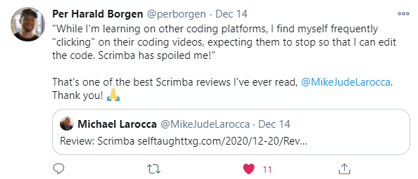
"That's one of the best Scrimba reviews I've ever read, @MikeJudeLarocca. Thank you! 🙏 "
— Per Harald Borgen, CEO of Scrimba December 14, 2020
10% Scrimba Discount!
If you're interested in taking a paid course from Scrimba, be sure to use the discount code provided: https://scrimba.com/pricing?coupon=Michael-Larocca-Discount-2023#join
Valid for an additional 10% off semester and annual plans. Expires on July 31st, 2024
Advance your career with a 20% discount on Scrimba Pro using this affiliate link!
Become a hireable developer with Scrimba Pro! Discover a world of coding knowledge with full access to all courses, hands-on projects, and a vibrant community. You can read my article to learn more about my exceptional experiences with Scrimba and how it helps many become confident, well-prepared web developers!
Important: This discount is for new accounts only. If a higher discount is currently available, it will be applied automatically.
How to Claim Your Discount:
- Click the link to explore the new Scrimba 2.0.
- Create a new account.
- Upgrade to Pro; the 20% discount will automatically apply.
Disclosure: This article contains affiliate links. I will earn a commission from any purchases made through these links at no extra cost to you. Your support helps me continue creating valuable content. Thank you!
Conclusion
After taking on Scrimba's overloaded avatar component challenge, it's becoming more apparent to me how programming in React allows you to easily create versatile websites, benefiting not only the users but also the developers.
A prime example of React's versatility is creating the Avatar component, which renders various avatars depending on the properties passed in. Additionally, React's ease of installing libraries, such as the React Icons, further enables YOU as a developer to create a robust UI/UX experience effortlessly.
Now it's your turn! Take your React projects to the next level by creating and implementing versatile components like the Avatar component, and be sure to share your creations with the developer community!
Let's connect! I'm active on LinkedIn and Twitter.
Have you successfully created a versatile Avatar component in React? Are you excited to explore more ways to enhance your React applications with dynamic components? Please share the article and comment
Please share it!